ShopDreamUp AI ArtDreamUp
Deviation Actions


Suggested Deviants


Suggested Collections


You Might Like…


Description
yeah I still do those colourful semi-realistic portraits, despite the recent animal-spam 
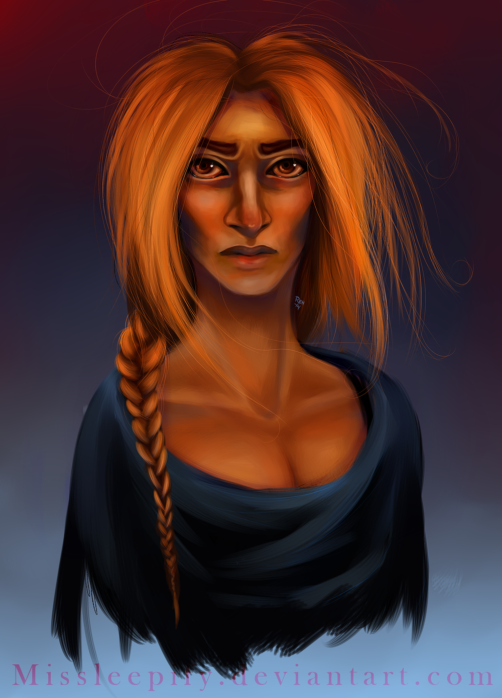
One of my sister's OC's I just randomly decided to draw after one of those
prompts-thingies. The features I got fitted with my image of her so I just took the opportunity to practice people painting
Also her name is apparantly Morrad cause she rad and she's apparently totally bonkers and usually happy and stuff but I made her sad and serene and with magic bust floating powers in the air OOPS TOO BAD SISTER I HAVE ARTIST LICENCE SO IT'S CANON NOW
IN OTHER NOTES I was really happy with the backround and lightening for some reason blue and red is my OTP no kidding
Tumblr post (there's always a tumblr post): missleepify.tumblr.com/post/80…
Image size
1000x1391px 1.32 MB
© 2014 - 2024 Missleepify
Comments7
Join the community to add your comment. Already a deviant? Log In
Great work on the hair, as usual! Her eyes are so intense and draw me in a lot. She looks so alive and almost kind of sad...
I like your fusion of realistic/cartoon style. It works very well indeed!
Some suggestions:
Her face looks a bit stiff, especially around the jaw area. There should be more shading there (think of a cylinder or a cone, with the reflections), because right now, it looks like the top part of her face is adequately shaded, whereas the jaw and the chin look unfinished/two-dimensional.
The hair is very detailed and nicely done, but I think there should be more shading on the sides and the highlights should be a little more obvious. Right now, the hair looks rather flat despite the details and it looks like it's only coming from the front of her head, rather than from the sides and you know, all around her head. You can fix this by shading more on the sides and on the top and making highlights more obvious around the middle of the head (where the head "sticks out" the most).
Her braid also looks like it's not part of her hair, because it's a little removed from the hair. Also, the texture of the braid makes it look almost like plastic. Adding a couple more stray strands and making the existing strands more obvious would work!